
Project Overview
Wolverine Winter is an interactive feature for The Michigan Daily website to help University of Michigan students combat seasonal depression. The feature centers on an interactive campus map where students can post and explore their favorite winter spots, encouraging them to find activities, go outside, and connect with others to reduce feelings of isolation in the colder months.
Interviews
To better understand how seasonal depression affects students and what kinds of features could support their well-being, I conducted user interviews with three University of Michigan students. I explored how students currently cope with winter isolation and what contributes to their winter blues. I asked questions such as…
How was the last winter in Michigan for you? Why did you feel that way?
How do you usually spend your days during the winter months? Why do you choose to do that?
How do you usually feel about doing your day-to-day activities during the winter months? Why?
Where do you like to spend your time on campus during colder months?
Do you have a favorite season at Michigan? Why or why not?
The most common themes that emerged from my interviews were feelings of isolation, limited access to activities, and a general lack of motivation during the colder months.
AI-Assisted Synthesis
After conducting interviews, I used Notion AI to cluster recurring themes from my notes and identify early patterns. helping me quickly identify patterns across responses and structure the data more efficiently


Synthesis in Figjam
While I used AI as a starting point, I went back through the transcripts manually to validate the themes and make sure they accurately reflected what the participants shared in order to maintain human empathy. I used FigJam to annotate my transcripts and cluster recurring behaviors and sentiments. The most common themes that emerged from my interviews were feelings of isolation, limited access to activities, and a general lack of motivation during the colder months.

Problem Statement
Michigan students experiencing seasonal depression want a way to build small, consistent wellness habits so they can manage low energy and motivation in the colder months.
User Personas
Drawing from my user interviews, I created two personas to represent University of Michigan students during the winter months.


Journey Map
Then, I created a journey map to visualize what a typical student experiences during seasonal depression and identify moments where my product could make a difference. The map highlights emotional lows, lack of motivation, and feelings of disconnection throughout the winter, helping me identify opportunities for Wolverine Winter to encourage connection and engagement with campus life.

Concept Ideation
After conducting research and mapping the user journey, it became clear that students struggling with seasonal depression were seeking small, accessible ways to feel better in their daily environments. Many students shared that during the winter months, their biggest reason for staying in their rooms and feeling isolated was because they didn’t know what there was to do on campus.
Drawing from this insight, I decided to create an interactive campus map on The Michigan Daily website to make exploring winter activities on campus more inviting. It would encourage students to rediscover campus during the colder months by highlighting cozy indoor spaces, outdoor winter activities, and opportunities to connect with others. Additionally, since The Michigan Daily is a platform students already regularly visit, integrating this experience within the newspaper made it both credible and accessible.
Competitive Analysis
I conducted a competitive analysis of the 3 most popular platforms that students use to discover activities on campus, aiming to identify gaps my solution could address.


Michigan Event Hub: Key platform to view campus events
Opportunities: Simplify UI, increase interactivity, expand beyond just academic events; give students a platform to post their own events
MaizePages: Central hub for student organizations
Opportunities: Allow students outside of certain clubs to view and attend events; allow students to RSVP
Google Maps: Well-known and familiar tool for navigation and discovery
Opportunities: Increase community/interaction amongst campus; allow students to post
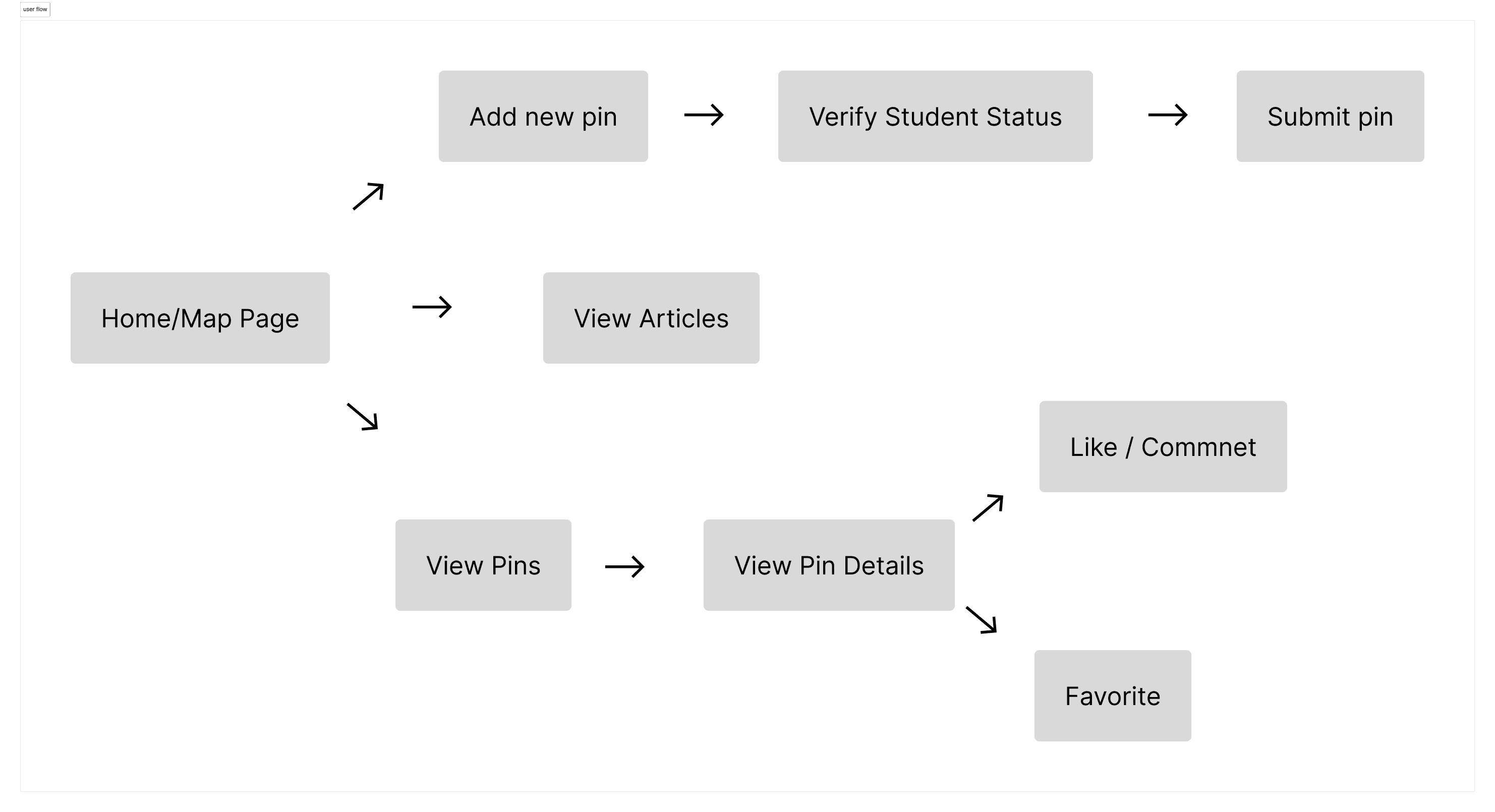
User Flow
I created a user flow to map out how students would navigate Wolverine Winter, whether it be sharing pins or favoriting events. This helped me visualize the main interactions, ensure the experience was smooth and aligned with students' goals of finding community in the winter.
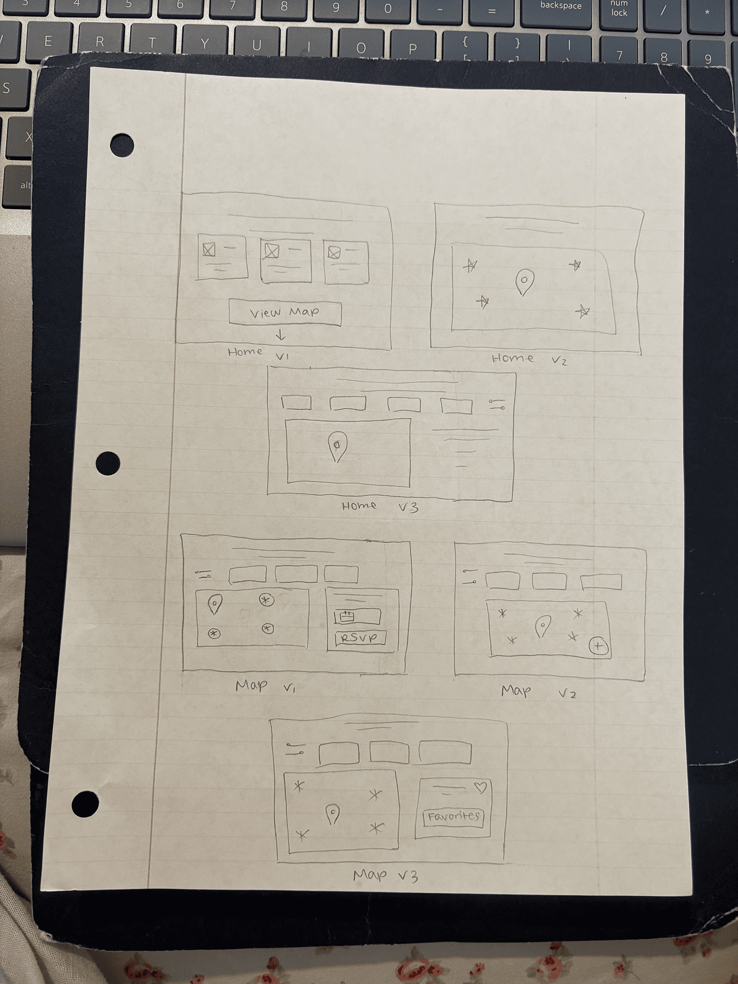


Wireframes
After exploring different layout ideas, I moved on to creating wireframes. I decided to feature the map directly on the homepage so users immediately understand the site’s purpose. Instead of an empty state, I added a “What’s Trending” section to make the homepage more engaging. Additionally, before building the wireframes, I analyzed Google Maps’ UI to understand the functionality of online maps so that my map would be usable and familiar to users.


User Feedback
I gathered feedback from peers to refine usability before moving on to my high-fidelity designs. Their suggestions helped me identify areas that needed more clarity and interactivity. Here are the main takeaways and how I addressed them:
Clarify selected pin: Users found it unclear which map pin was selected, so I decided to enlarge the active pin for better visibility.
Label the map center: Users wanted a clearer point of reference on the map, so I labeled the Diag as the map’s center to help with orientation.
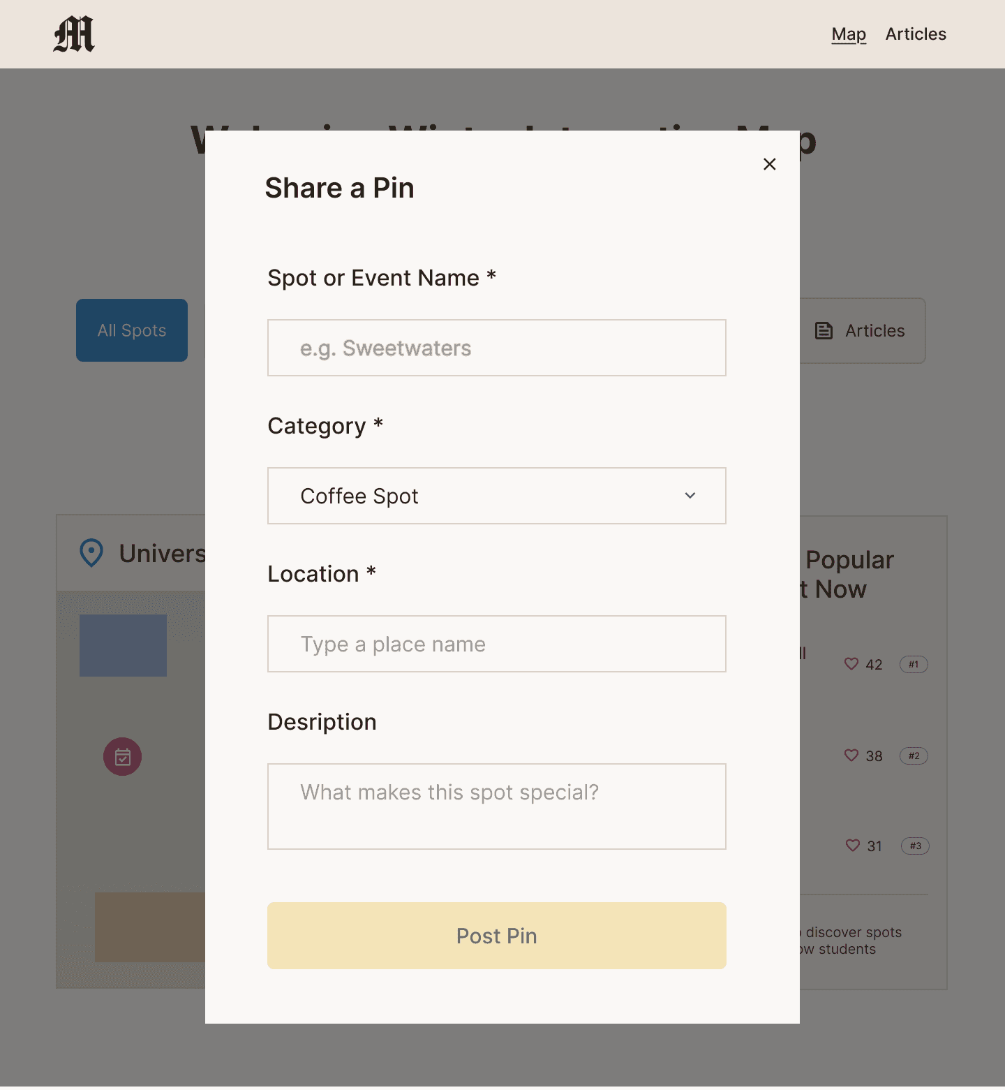
Unclear Functionality: While users were able to view comments, they were unsure how to post a comment, so I added a “Post Comment” button to account for that interaction.
Design System
Next, I created a design system to establish consistency across the website. I chose maize and blue as the primary colors to reflect the University of Michigan’s color palette. I also built key components, including button states, dropdowns, typography styles, and map icons, to maintain a cohesive interface.

High Fidelity Prototypes
I incorporated the user feedback and created high-fidelity wireframes for nine key screens, including the homepage, posting modal, pin interaction with comments, articles page, favorites page, and more.


Interactive Prototype
I created an interactive prototype for usability testing in order to understand how users interact with key website screens.
Usability Testing [Round 2]
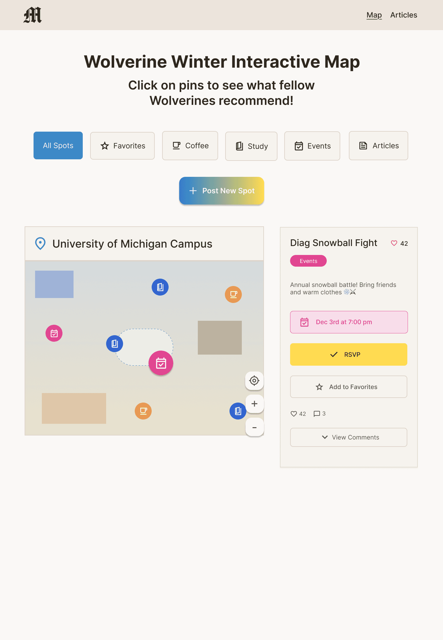
After creating my high-fidelity prototype, I conducted another round of usability testing to evaluate how intuitive the interactions were and where friction points came up. The test task I gave my users were filter the map by events only and view the comments on the “Diag Snowball Fight” event, as viewing the pins on the map were a key interaction.
Observations + Findings:
Users liked that filtering immediately cleaned up the map instead of adding extra steps.
It was unclear which pin on the map corresponded to the Diag Snowball Fight, requiring the user to click around before finding it.
They commented that the card layout looked clean and aesthetic and that the interface felt easy to navigate.
Users proposed adding a distance filter to show what’s nearby.
Users said they could see themselves using this site in the future because it felt fun, engaging, and helpful for finding things to do in winter.
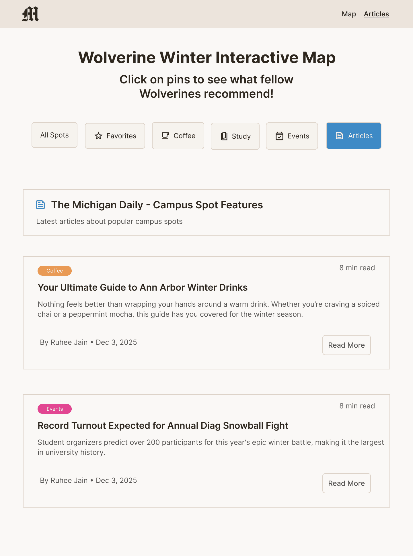
Article page feels really "text heavy" in comparison to the rest of the site.
Final Insights & Recommendations
Add map labels (major campus landmarks or a “You are here” marker) for better orientation
Include a hover state or label preview over pins so users can identify events without clicking
Add a distance filter or “sort by nearest” option to improve usability
Allow multi-select filters for more flexible exploration
When a user posts a pin, there should be some change in state to signify that it’s a new pin
Add images + interactions to articles page.
Revised Filters
I added a distance filter dropdown, as many users expressed they were mostly interested in going to the spots closest to them. This filter supports user control and freedom, as users can customize how far they want to explore and gives them the flexibility to view only nearby spots.

Enhanced Map Feedback
During testing, users mentioned it was unclear which pin corresponded to the event they had clicked on or posted. To improve clarity, I updated the map so that when a user selects or posts a pin, it becomes highlighted (slightly enlarged and glowing). This supports visibility of system status, as users immediately recognize the active pin.


Article Page: Before vs. After
Lastly, I redesigned the article page after users mentioned that its heavy text layout felt inconsistent with the rest of the site. They also ran into a dead end since the articles weren’t clickable. To address this, I added images to make the page more visual and linked the “Read More” buttons to actual Michigan Daily articles.

Reflection
Throughout this project, I learned that when it comes to complex topics like mental health, it’s crucial to continuously gather feedback and understand what truly supports users. I didn’t approach this project with the goal of “curing” seasonal depression, but rather creating something that could make users feel supported. By consulting users three times during this design process, I ensured their voices guided each decision. Overall, this project reinforced the importance of empathy, iteration, and designing with, not just for, users.
After sketching several layout ideas, I used UXPilot AI to quickly generate additional homepage wireframe variations. I wanted to explore alternative layout structures beyond my initial sketches, particularly how the interactive map could be positioned to guide users toward discovering winter spots.
The AI-generated layouts helped surface a few different directions, including one where the map was placed to the side of supporting content and another where the map was the central focus of the page.
Reviewing these variations helped me evaluate how strongly the map functioned as the primary call-to-action. I ultimately decided to move forward with the layout where the map was most zoomed in and visually dominant, making it immediately clear that exploring campus spots was the core interaction.
